
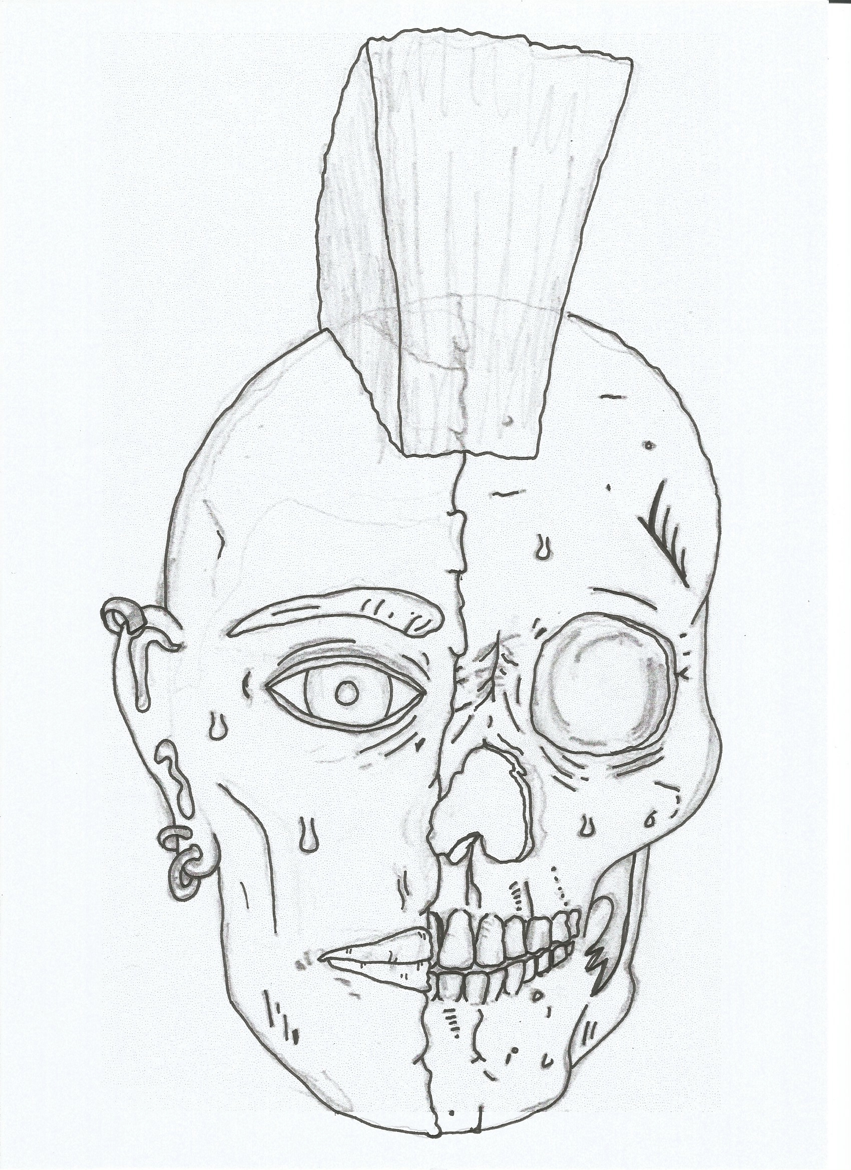
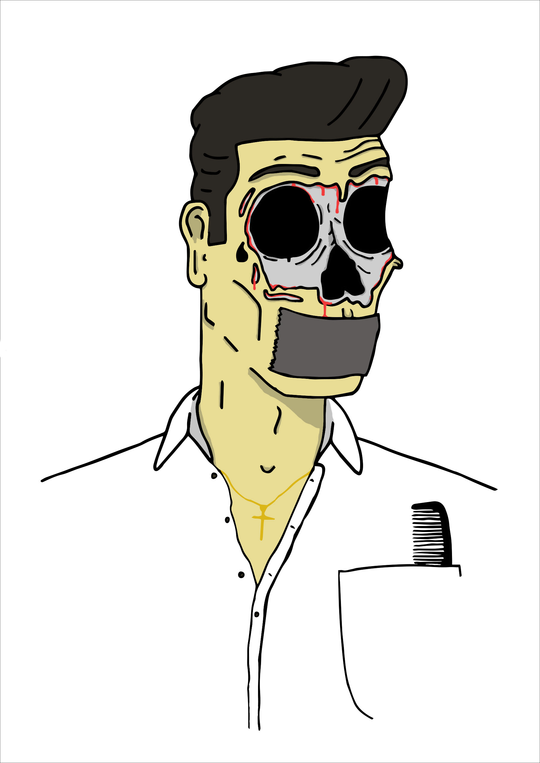
This illustration was used on my CV, to show my skill with illustration. Here I have put 3 images of the design, that go through the process I do when making an illustration. First I draw the image and go round the outlines with a fine liner.
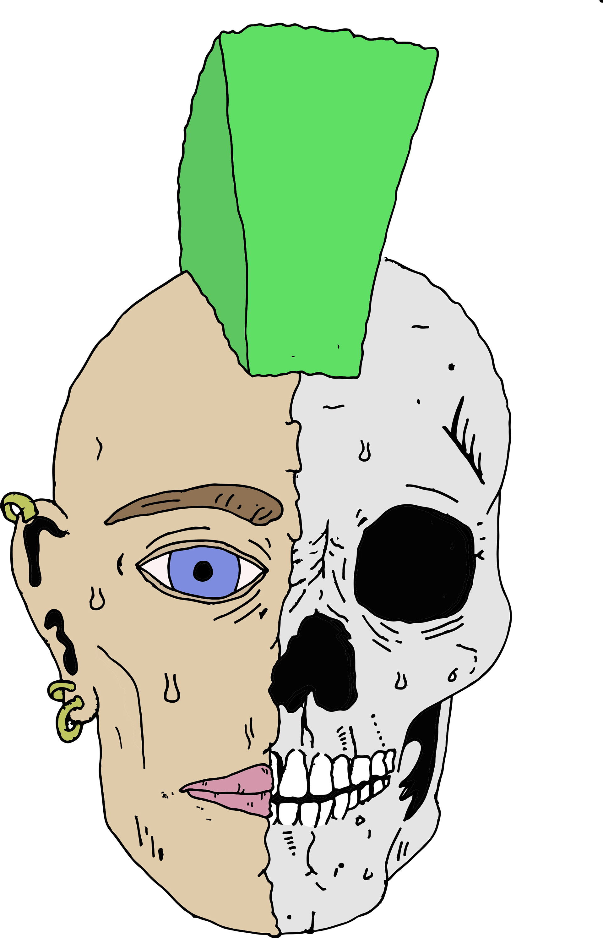
I then use Adobe Illustrator to trace the image and make it in to a digital piece. I begin the colouring process, starting with the main colours that make up the image.

Finally I put the image on to Adobe Photoshop where I add the detail to the design and touch up any areas. To do this I use a graphics tablet for a bit more freedom and better control.

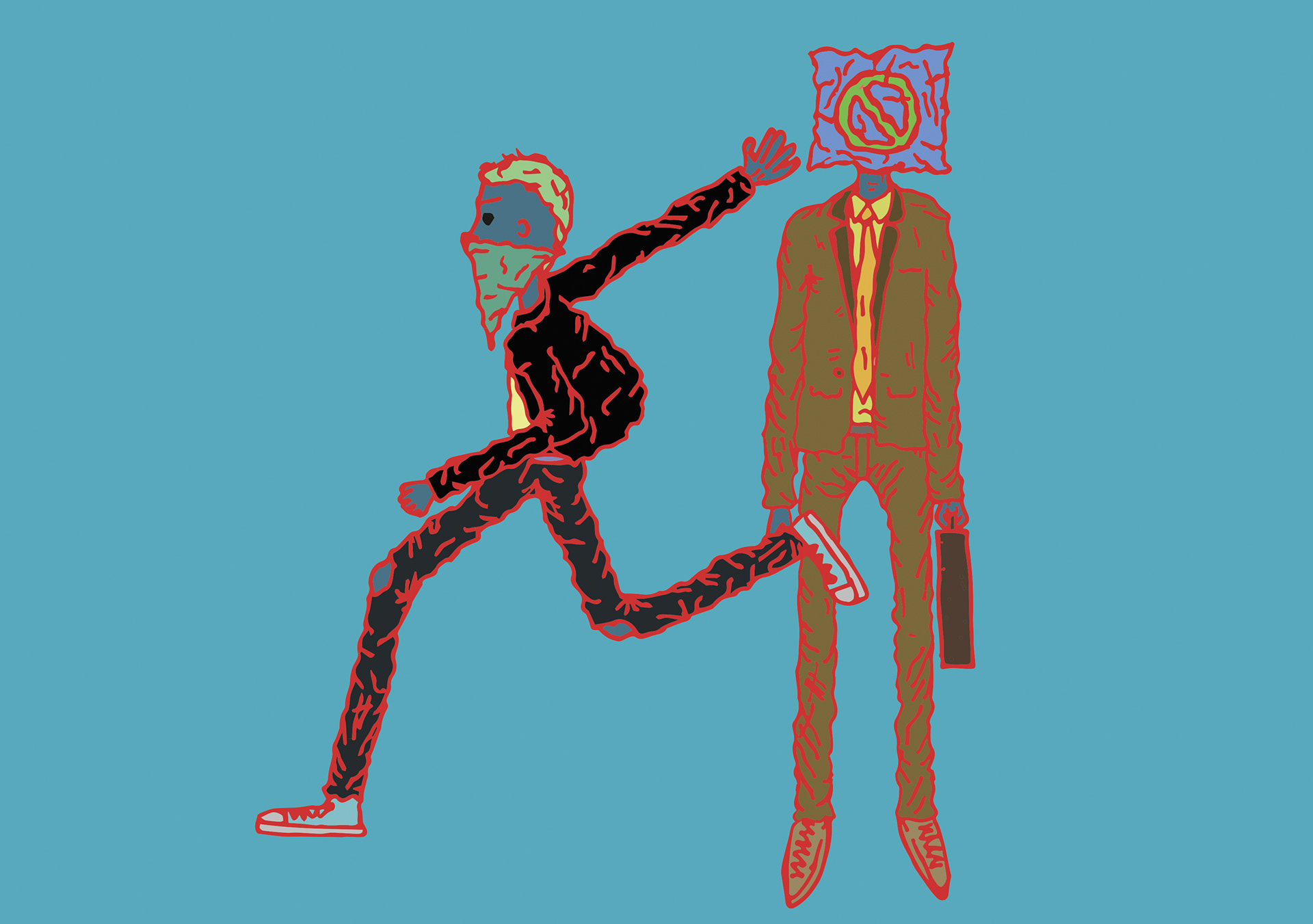
This illustration is inspired by one of my favourite illustrators, Gerhard Human (https://www.behance.net/gerhardhuman). I experimented with the colours on this design, to see which really contrast and make the image stand out. The use of lines on the design give to image more depth and a sort of texture.
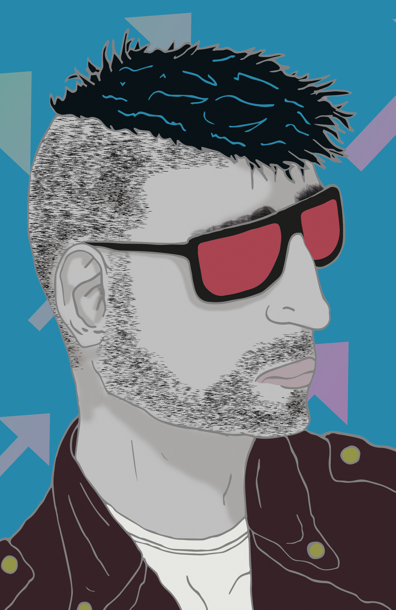
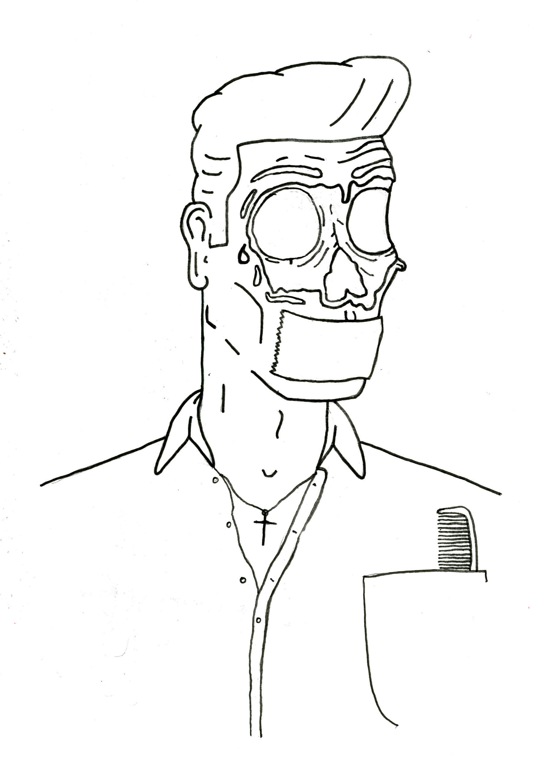
With this illustration I explored different techniques of shading and texture with brushes on Photoshop. Again I used an unconventional colour scheme to give the image an edge, the contrast of colours help the image stand out.